Critical Debates - MDX

blog posts regarding my thoughts and ideas on the readings for Critical Debates at MDX

Seminar 5 - Borders, Liminality, Transgressions (click to comment)

Mary Ann Bolger - The Ephemera of Eternity: The Irish Catholic Memorial Card as Material Culture


Mary Ann Bolger’s essay focuses on the lack of change that has occurred in Catholic memorial cards over the years, at least regarding those mostly found in Ireland. This topic does beg the question, does tradition ever limit development? Catholicism and religion in general are very rooted in tradition, although changes have been made over time. Vatican II was one of the most noteworthy times when major changes were made, such as the orientation of mass, certain prayers, how one may receive the Eucharist, and the vernacular in which the mass was said. But these changes were declared in a very official capacity, do prayer cards need the same type of approval in order to be changed?

Gravestones also have been fairly regular for years, although the Lake View cemetery in Cleveland, OH shows that not all gravestones are cookie cutter. Some are shaped like your standard tombstone, but others are shaped like a man sitting on a bench, a jukebox, and even a lion! It’s difficult to realize they are gravestones at first glance due to their unconventional shapes, but exploring the cemetery to find them is rather entertaining. I can’t say that uniquely shaped gravestones is a common trend, though.

Alan Freed Gravestone back - photo by Victoria Trentacoste

Alan Freed Gravestone back - photo by Victoria Trentacoste

Alan Freed Gravestone front - photo by Victoria Trentacoste

Alan Freed Gravestone front - photo by Victoria Trentacoste

Bolger does misstep at some points in her essay. Not only does she mention but shows a variety of prayer cards, from ones with religious iconography that are folded like a card to double sided laminated ones featuring photos of the deceased. While Bolger has a point that for the most part the design of the cards has remained fairly unchanged, there have been some developments in design over the years. Memorial and prayer cards have a way of bringing comfort to family and friends of the deceased. Personally, I have a drawer of them at home and there is something quite lovely in looking through and remembering those who have been important in my life. It is also a way of documenting dates or calculating ages. When my great aunt passed away at nearly 103, it was fascinating to imagine how she saw the world change since her birth in 1911. There is something nice about all of them appearing, for the most part, the same because I am able to immediately know what they are when I see them. If I attended a wake or a funeral and the memorial cards looked drastically different, I’m not sure I would know what they were. Even Figure 12 (the 2002 card) in Bolger’s essay does not immediately strike me as a memorial card. Its contemporary design makes it look more like a snapshot than a remembrance card.

Figure 12 - Bolger, 2011

Figure 12 - Bolger, 2011

Bolger’s article seems to focus most strongly on the Irish Catholic tradition. Perhaps there is more tension surrounding maintaining a sense of serious tradition in Ireland verses in other parts of the world? Religious art and imagery has been deeply rooted in tradition, but at the same time changes to the art have been incredibly significant and impactful. For example, the early Renaissance, around 1200’s, showed a dramatic shift in their religious art. Pre-12th Century depicted Jesus as upright on the cross to demonstrate His triumph over death. But in the 13th Century artists such as Cimabue and Giotto started creating images of Jesus suffering on the cross, bent over and in pain, conveying a more human Christ. This change represented a dramatic change in how God related to human beings and the views emulating from the church.

Alberto Sotio - The Crucifixion with the Virgin Mary and St John - late 12th Century

Alberto Sotio - The Crucifixion with the Virgin Mary and St John - late 12th Century

Cimabue - Crucifix - 1268-71

Cimabue - Crucifix - 1268-71

So many other forms of printed ephemera have gone through changes and developments, in fact many catalogues, magazines, and brochures make efforts to re-brand design, change layout, or switch printing techniques. Wedding invitations in particular have changed over time, and there is some divided opinions whether or not this is for the better. Those who have chosen a digital invite are often scoffed at by more traditional family members, and even the lack of an inner and outer envelope can be means for a tisked tongue. But other forms of print have had less changes, such as the newspaper and playbills. These have, for the most part, remained fairly regular in style and format.

via Pinterest

via Pinterest

via Britannica

via Britannica

If something hasn’t changed in years, maybe that means there is no need for it to change? Eye glasses, violins, even scissors aren’t all too different today than they were 100 years ago. In fact, several years ago Google invented the Google Glass, although this technological advancement to the eye glass didn’t catch on all too well. Although one of the most interesting times in which modern technological advances ended up countering the effectiveness of an object was the “Jabulani” ball in the 2010 FIFA World Cup. Adidas used 3D panels to create a perfectly spherical ball which they claimed to be more aerodynamic. Instead, the players disliked using the ball as they found it to be unpredictable. Perhaps memorial cards aren’t so dissimilar. Maybe changing their design will work against what is integral to their significance.

“Jabulani” ball - via Popular Science

“Jabulani” ball - via Popular Science

It’s interesting that Bolger feels those who move away from traditional cards are trying to reject the traditional ideals of death, or at least that’s what I got from her essay. On the whole I wasn’t sure if she had the strongest argument that prayer cards haven’t changed at least a bit. Or maybe that really is what the essay conveys, that there hasn’t been much change because some things in this world don’t need to be changed. What seems most ironic regarding prayer or remembrance cards is that the person featured on the card is likely to have absolutely no say in the design of that card. Unless they have spoken to their loved ones prior, the image, text, and design will be entirely up to the decision of either a family member or, as does happen, the funeral parlour. There is something a bit sad in the distance that this creates between the deceased and the card memorialising them.


References

Bolger, M.A. (2011) ‘The Ephemera of Eternity: The Irish Catholic Memorial Card as Material Culture’, in King, L and Sisson, E. (eds) Ireland, Design and Visual Culture: Negotiating Modernity, 1922 – 1992. Cork: Cork University Press, pp.235-247. 

Links

https://twentytwowords.com/brazils-president-accuses-leonardo-dicaprio-of-funding-amazon-fires/?astest=true

https://edition.cnn.com/2010/SPORT/football/06/02/football.jabulani.ball.world.cup/index.html

http://collections.vam.ac.uk/item/O18120/the-crucifixion-with-the-virgin-oil-painting-sotio-alberto/

Victoria TrentacosteComment
Seminar 5 - Borders, Liminality, Transgressions (click to comment)

Gabriela Elgenius - National Flags, the Politicization and Sanctification of Nations


This essay by Gabriela Elgenius centers around the idea of flags carrying narratives, significance, and histories all their own which relate to the identity of those whom that flag represents. On the whole, the article was more academic in documenting how the flags of countries such as Spain, Croatia, Serbia, and Russia developed new looks over time and how these alterations were most often due to the political or social situations of those countries. When the political situation changed or borders which encapsulated that country were moved, the flag similarly went through a transformation. Consequently, identity can be tied to flags.

Flags are often political symbols as they contain a sense of distinction and, in some cases, stand for respect and pride. Elgenius mentioned that at times they even hold a sacred aspect. Vexillology, or the study of flags, is much more important than some people may think. While it may seem only necessary at Olympics ceremonies, businesses, such as hotels, depend on a knowledgeable and well informed person to ensure correct flags are being flown as needed. When I worked at a hotel in Manhattan, there was someone in charge of deciding which flags were to be flown on which sides of the buildings everyday. This was dictated by who was staying at the hotel at that time or if there were any important event happening in any countries in the world. For example, on Australia Day she chose to fly the Australian flag, which she took particular pride in doing since she was from Australia.

Waldorf Astoria New York - Australia Day - via Pinterest

Waldorf Astoria New York - Australia Day - via Pinterest

Tying into Elgenius’s essay and the sense of territory that can be portrayed in a flag, the Australian flag, and many other southern hemisphere flags, contain the Southern Cross Constellation to represent their global location. This fact is something I happened across in my research (https://brightside.me/wonder-curiosities/32-world-flags-that-are-so-creative-they-mustve-been-made-by-geniuses-592260/). Previously I had not realized that’s what the collection of stars represented, but this constellation can be found on other flags such as Papua New Guinea, Samoa, and New Zealand. There is a sense of pride that seems to come across in these countries’ desire to illustrate their location, their territory, to the world on their flags.

Southern Cross Constellation © Wikimedia

Southern Cross Constellation © Wikimedia

Elgenius brings up the fact that flags at their root are simply cloth, but humans bestow meaning and significance onto the cloths which is how they become national symbols. Flags are a vehicle through which people are able to convey loyalty and, in some cases, ownership. The Union Jack, for example, is joining of St. Andrew's Cross (Scotland), St. George's Cross (England), and St. Patrick's Cross (Ireland). One flag is used to represent the joining of three countries. How each of those individual countries react to their joint flag may not always be the same. Scotland is quite proud of their own heritage and this translates through their abundance use of their Scottish flag. A flag becomes a sense of identity, which is the case with Ireland, Iceland, and Finland as well as Scotland. Some states in the US are very proud of their state flags, such as Texas. In fact, you often see more Texan flags being flown in Texas than USA ones. Meanwhile the residents of other States probably couldn't recognise their own flag.

Texas Flag

Texas Flag

Colour and image convey great significance in relation to political, territorial, and social histories of a place. Adding and removing of symbols can show a change in political situations. Elgenius highlights the changes to the Spanish flag, but even in today’s society the flag of The Philippines changes regularly on whether or not they are at war.

The Philippines © Wikimedia

The Philippines © Wikimedia

The colors and images on flags can also convey revolt, such as Ukraine with the Orange Revolution against the Ukrainian Presidential Election in 2004-2005. This actually reminded me of The Gates installation in 2005 that was done in Central Park by Christo and Jeanne-Claude. They were simply orange cloths waving in the winds sweeping through Manhattan, but seeing them erected suddenly gave a sense of importance to them. Again, this is what happens when the human mind interacts with an inanimate object: suddenly that object has meaning. We as humans cannot help it, and that’s why flags hold so much power.

The Gates - Central Park - © 2005 Christo and Jeanne-Claude

The Gates - Central Park - © 2005 Christo and Jeanne-Claude

When we look at flags as important symbols, how they are treated becomes incredibly important. Burning of flags is surrounded by much debate and controversy. It’s a way to show displeasure or disagreement with government or country, BUT many feel it is an unforgivably offensive. Wearing of flags can show solidarity or togetherness. Protocol related to the flying, storing, and presenting of flags, at least in the US, is quite detailed. Certain laws exist outlining how and when flags can be flown, often flags are flown at half mast to show honor or respect for a person or event. They are given out to families who have lost loved ones in war, and often this gesture can have a remarkable reaction. One photo even was able to capture the weight of one such situation after 9/11 and the US flag is central to the image.

8 year old Christian Golczynski accepting the flag for his father

8 year old Christian Golczynski accepting the flag for his father

While I tend to gravitate towards a flag representing togetherness, Elgenius focuses more on how a flag can convey division. "National flags authenticate boundaries that are often contested in newly reconfigured states and, far from unifying, they enforce divisions" (Elgenius, 2011). She has a point. What I found interesting about her research was it made me realize the great importance in correctly dating flags when used in time period films or tv shows. Authenticity is crucial to convey the political and social issues of the time.

But it’s not just in flags that pride or discontent for a country can be shown. Both language and currency are similarly significant. For example, Catalan is spoken more in Barcelona than Spanish which shows the division between the two cultures. Accents in the UK and US also make clear distinctions and divisions, though the subtle differences between a Long Islander and a Bostonian or a Liverpudlian and a Londoner are often only noticed by people in those countries or areas. In regards to currency, many countries use their currency design as a way to show off parts of their history for which they are proud. Neil deGrasse Tyson does a talk about how many European countries feature brilliant and inspirational thinkers, philosophers, mathematicians, and scientists with their work on their currency while the US falls short in this regard.

Neil deGrasse Tyson - YouTube

Neil deGrasse Tyson - YouTube

The essay did spark a few questions, such as can flag convey a sense of shame? As the UK is making efforts to leave the EU, will the EU flag change? Or will it’s impact and reputation change in the minds of those in this country? There is quite a lot of art in designing a flag, drawing on history, symbols, images, colours, coat of arms, or even alphabets such as the Cyrillic alphabet with the Serbian flag. If two flags are too similar, are there feeling of plagiarism? Monaco and Indonesia, for example, are almost impossible to tell apart. Similar to in the art world, where is the line between mimicry, inspiration, and forgery? And furthermore, if two countries, such as Indonesia and Monaco or Chad and Bolivia, have flags that are almost identical, doesn’t that negate the power of flags to symbolise a territory or a people?

It was challenging to read about some of the other traditions surrounding flags in other countries. The US pledge of allegiance is directed towards the flag and people where red, white, and blue to show their patriotism. In Sweden, the flag has become a "party -symbol" (Elgenius 2011) and the Danish flag is used to encourage consumption by standing for the "good life" (Elgenius 2011). I understand that every country differs in its feelings of their own flag because of associations which have been connected to it, but still it is very odd for me, an American, to hear that another country's flag could be innocuous or even represent eating. In the US, there is such respect and pride held in the flag, although admittedly we still print it on on teacups and pillows. In some regards, our flags and our relationships with them make we wonder, what do we teach with our nationalism?

 
Victoria TrentacosteComment
Seminar 4 - Activism, Politics and Authorship (click to comment)

Theresa O’Keefe - ‘My Body is My Manifesto! Slutwalk, Femen, and Femenist Protest’


Are women who dress provocatively are sluts? Who gets to decide how a woman displays her body? Society today seems to believe these questions are up for debate. But Theresa O’Keefe wants to look deeper into these issues and the way in which SlutWalk and FEMEN deal with them.

SlutWalk and FEMEN have policies and standings with some good points, but there are a number of flaws. SlutWalk is a feminist group which fight against the idea that scantily clad women are asking to be raped and how the word “slut” is used by society and police. The walkers usually wear burlesque and what’s considered “slutty” attire and often have the word “slut” written across their chest or on signage. The whole atmosphere of the walks is centered around a sense of gaiety, similar to Pride, and seems more celebratory seeing “slut” as sense of pride. This is where O’Keefe points out a crucial flaw in SlutWalk. There’s controversy over claiming back “slut” because it sends mixed signals, in particularly to adolescents. In order to not be labeled a slut you must dress like one? Maybe the issue isn’t in the word but rather in the perception of the clothing. Would it be more effective to dress provocatively and hold signs which say “NOT a slut” or “Beautiful” instead to redefine what the clothing means? O’Keefe points out that the irony of their use of “slut” goes unnoticed to those observing. Men in particular only see their fantasies on display.

SlutWalk - London

SlutWalk - London

FEMEN is a bit more provocative. Women walk around topless with writing across chests and there is more a sense of defiance and sextremism. The purpose is to grab media attention, and they do. With the leaders of FEMEN being Amazonian in beauty with Ukrainian garland of flowers on their heads and sometimes heavy makeup, it’s difficult not to think FEMEN looks more like a magazine spread than a feminist group. FEMEN began as a way to reclaim feminism in Kyiv, but the whole image of it meets exactly what male fantasy conventionally is. In addition, their role models being, well, models in appearance, further defeats the purpose of a free body being any body because those not physically fit seem to be discriminated against.

In life drawing I enjoy having a variety of bodies to draw because it makes the pieces more interesting week after week. It has also taught me to see the beauty in every body I come across, not just the ones that are deemed “conventionally attractive” in society. Some beauty ad campaigns have begun doing this, such as Aerie showing more natural looking females modeling their clothes. This celebration of diversity is seriously lacking in the SlutWalk and FEMEN groups.

Aerie - The Real Me

Aerie - The Real Me

Most of those depicted in SlutWalk and FEMEN have been young, white women, meaning they’re not very diverse. In addition, “slut” is more often associated with white women and how they dress while black women are more often defined solely based on their skin color. Since “slut” is also more often associated with slimmer women, SlutWalk doesn’t always encompass different ideas of beauty, body, and orientation. FEMEN calls for women to go topless and ignores the sense of shame associated with that display. For some races, a history of being displayed naked does not seem to agree with baring a bare chest today. On the whole, what FEMEN does objectifies the woman instead of empowering them. It reminds me of Sarah Baartman, the Venus Hottentot, and how that image seemed very close to the cover Kim Kardashian did in “Kim breaks the internet.” Instead of seeing a confident woman, I saw a woman on display for public viewing, just like Sarah Baartman. It makes me wonder why we won’t focus on the mind of the woman? Are you just showing women as being defined as beautiful based on their bodies alone? These feminist groups seem more interested in the physical sense of a woman, but their efforts seem to fall short even there.

Sarah Baartman “Venus Hottentot” and Kim Kardashian

Sarah Baartman “Venus Hottentot” and Kim Kardashian

While SlutWalk and FEMEN show the female body in explicit ways which doesn’t succeed in changing the patriarchal signifiers, rather it enforces them, they do demonstrate the struggle of the female body and what defines feminine protest. SlutWalk and FEMEN are more pastiche, as O’Keefe mentions, but end up just showcasing and repeating the norms of society instead of turning them on their heads and ridiculing them. O’Keefe mentions Postfeminism in her article as well. She seems to view it as women taking control and celebrating their sexuality and freedom, but in ways which border on pornographic depiction with stripper heals and pole dancing. What if the women celebrated as beautiful were photographed with clothing that covered more? Would that show that they were successful because of what they’ve done with their minds and beautiful while still fully clothed? You shouldn’t have to dress provocatively in order to be considered beautiful, strong within yourself, or a feminist. In the end, it’s difficult to define “feminism” when not everyone may agree on its definition, values, or concerns.

Personally, I think that the media has a significant influences in all this and O’Keefe fails to mention this. While the Aerie campaign for The Real Me makes some strides in the world of modeling, what about other industries? Women have a right to want to look or feel sexy, but what defines “sexy?” Seems like the media has better control of its definition than women do. For example, Margot Robbie’s costume in Suicide Squad as Harley Quinn was incredibly provocative. I don’t believe she had much say in her outfit, and so she had to prance around in shorts that were better defined as underwear. In previews of her next film as that character, Birds of Prey , you can see her shorts are slightly longer, though still very short. By gaining some credibility in successfully portraying the character in the first film, Margot Robbie maybe was able to influence how the character dressed in the second, allowing her to lesson (slightly) how provocatively attired she was. It makes me think, how does media contribute to slutshaming? Seems as though they both encourage dressing like a slut but then support the shaming of the women who do.

Margot Robbie - Suicide Squad

Margot Robbie - Suicide Squad

Margot Robbie - Birds of Prey

Margot Robbie - Birds of Prey

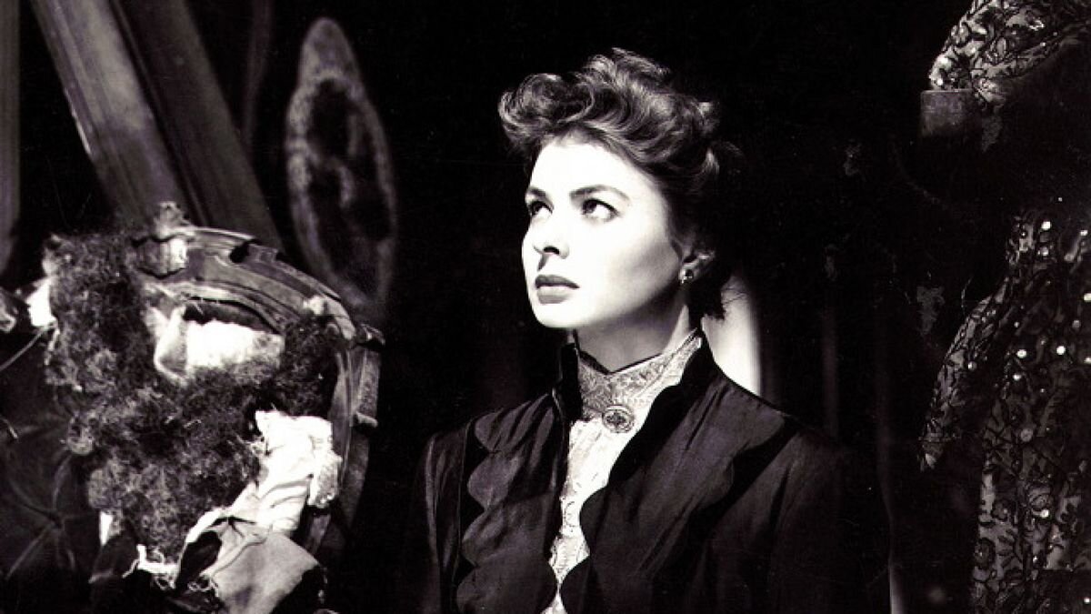
The SlutWalk and FEMEN groups don’t seem to be ones I would want to participate in, namely because I’m not sure they hit the mark intended. I’d be interested to see a movement where women dress however they want, ball gown, bikini, jeans and a button down blouse, and hold up signs that say “I feel beautiful” to show that beauty and feeling sexy has more to do with how you feel and not what you wear. For me, an even better depiction of a woman reclaiming her power is the play Gaslight where at the end the woman is holding the power in her hand and mocking the man who made her believe she was crazy. The ending scene is powerful, impactful, and empowering, it resinates much more with me on the power of women than either SlutWalk or FEMEN do.

Gaslight (1944) - Ingrid Bergman

Gaslight (1944) - Ingrid Bergman

Sometimes our causes aren’t understood. For example, one season of Project Runway had a theme of “What do you care about” and the designer Tessa Clark created one about body image. The main idea behind her design had to do with her own personal experiences, but unfortunately this didn’t translate well and the outfit fell flat on design. Similarly, SlutWalk and FEMEN both fall short of properly conveying their cause to the public, there is a misunderstanding and disconnect between the visual portrayed and the underlying message. But then again, maybe there isn’t one blanket way to express feminism.

Project Runway - Season 17 - Episode 10 What Do You Care About - Tessa Clarke - BravoTV

Project Runway - Season 17 - Episode 10 What Do You Care About - Tessa Clarke - BravoTV

 
Victoria TrentacosteComment
Seminar 4 - Activism, Politics and Authorship (click to comment)

Nicholas Mirzoeff - ‘Changing the World’


Reading Nicholas Mirzoeff’s essay ‘Changing the World’ struck up many questions in my head regarding how social media influences political uprisings and social campaigns, and vice versa. The article, on the whole, discusses rebellions and upheavals against governments across the globe and how they have become influenced and fed by the use of social media and the internet. It is interesting how the two feed off one another. Mirzoeff summarizes this well when he says “[t]his set of effects, from protests to social media, mainstream media and back to protests, is indicative both of how the new global situation has changed and how change itself is now a key subject for anyone interested in the visual” (Mirzoeff 282).

Personally, I believe that in today’s age the media has a significant influence on public opinion. Often it is difficult to determine truth from what is projected on our screens. Even some television personalities adopt personas which better elicit reactions, even though those personas may not be a true representation of them as a person. Do they then believe in the views they express, or are those views just part of the character as well? Media today often creates guilt in people who don’t completely agree with the opinions displayed as “right.” Suddenly you’re seen as “closed minded” or “ignorant and backwards thinking” if you question what the media wants you to think. This idea then seems to emerge that you’re entitled to your own opinion as long as it’s the same as my own or doesn’t go against my own. But when are there negative consequences to trending ideas represented in social media?

How does the internet spread information about these things? “Go Fund Me” or hashtags beg the question are you interested in the cause or just feel the need to participate? During the #MeToo movement I heard some debate and differing opinions regarding participation by certain people. Some believed people ‘telling their story’ enhanced the movement, while others disliked everyone using the hashtag as they felt it diluted those who had been deeply hurt or effected by the issue. Did some only use the hashtag to get a sense of popularity brought on by the movement? Are there times where the media influences us in a way that doesn’t portray the full story?

From Mirzoeff’s article it’s clear that Social Media makes a difference. Tarek al-Tayeb Mohamed Bouazizi set himself on fire in December 2010, afterward a revolution started, year earlier another man had done the same, Bouazizi’s act had received more publicity via Facebook which helped spark the revolution. This makes me wonder, is social media the new art? How can art affect change? JR, a French ‘artivist’ during 2011 revolution in Tunisia noticed that for 40 years the only portraits publicly displayed were of dictator Zine al-Abedine Ben Ali. JR decided to bring invisible people from the revolution into the public eye. He used public spaces and worked with Tunisian bloggers, local photographers, and interlocutors to show portraits of those involved in the revolution. Some locations were boldly chosen such as the one placed on Ben Ali’s former house. But JR was criticized for only including 100 posters. As artists, if we are trying to create art for a cause, is it possible we will still encounter lashback or negativity from people who agree with our cause, such as JR’s criticism?

JR - Inside Out - Artocracy Commissariat

JR - Inside Out - Artocracy Commissariat

The Egyptian revolution in 2011 was one of the most striking discussed in the article. Graffiti in Egypt became a way for people to reclaim public space from the dictatorship and through the use of public art people were able to connect with the issues who may not have access to social media. Mohamed Fahmy aka “Ganzeer” was one of the most influential street artists. One of his pieces showed a tank taking down a man on a bike carrying bread (the Egyptian’s representation of life). In 2014 the dictatorship tried to shut down the street art, silencing the voices against the oppression. Ganzeer wrote a pamphlet about how to conduct a protest, he chose to use print instead of web to share it because the web is significantly easier to be tracked by the government. This was an interesting note in the article which I wish Mirzoeff would have explored more. Perhaps he avoided the use of print on internet distribution because it seems to counter what his greater argument is trying to convey? But social media and the internet still had an affect on Ganzeer. When he was arrested for distributing a sticker, a Tweet caused a rush of people to come to the police station, resulting in his release. In the end, social media did have a direct result on the governmental system.

Ganzeer - Egyptian Street Art - unnamed

Ganzeer - Egyptian Street Art - unnamed

Ganzzer Egyptian Street Art - tank and bread in Cairo

Ganzzer Egyptian Street Art - tank and bread in Cairo

As I was reading I began to wonder what other events have happened in recent years, such as the Storming of Area 51 Facebook event, which have gained significant presence on social media? The Storming Area 51 started as meme and joke Facebook event, but, after the government got involved, it turned into Alien-Stock, a music festival in Rachel, Nevada, and was even sponsored by Bud Light. In this case, it was a large conglomerate, Budweiser, which were the partakers in the social media craze. What does it say when a large corporation, such as Budweiser, takes a side in social issues? Does this tip the public opinion scale in any way?

Bud Light - Alien-Stock

Bud Light - Alien-Stock

Art, especially public art that can be interacted with and shared on social media, seems particularly influential. Art has a way of conveying the emotion of a cause, not just the cause itself. One of my favorite pieces with a political edge done by Louisiana artist Brooks Frederick is a portrait of the President of BP pained with tar from the BP Oil Spill that the artist collected from the beaches of the Gulf Coast.

Brooks Frederick - BP “Oil” Paintings - series

Brooks Frederick - BP “Oil” Paintings - series

I am able to share this art because it exists online, but does social media allow issues to reach more people or does it at times isolate groups, such as those who don’t have Internet access or older generations who may not use it? Do these people not get to have a voice since they’re separated from the social causes?

When we see street art, do we always understand it? The Extinction Symbol (earth and an hourglass) by ESP, was something I learned about on a street art tour of Shoreditch and now I notice it on stickers and buttons. What began as a graffiti symbol has become the representation of XR (Extinction Rebellion). If our art is gathered up and used to symbolize a cause, would we agree with its use? What’s the different between this and being commissioned to create art for a cause? Where does our morality come into play? I would want to fully research any cause before my art became associated with it as the cause, or the way in which the cause is carried out, may not be in line with my own values. As artists in today’s world, these are important questions to consider when we put our pieces of art out into the world.

ESP - Extinction symbol

ESP - Extinction symbol

Art in relation to a cause came up in the Occupy Wall Street (OWS) and the WeAreThe99% sections of Mirzoeff’s article as well. Gillian Wearing is the artist behind Signs, comprised of over fifty colour photographs showing people holding up notes they wrote on a piece of paper. The exhibition series was displayed at City Racing, a small artist-run gallery in London in 1993 and was her first significant collaboration with members of the public. The 2011 OWS campaign in Zuccotti Park, New York demanding economic equality as well as the Tumbler account WeAreThe99% both had signs reminiscent of Gillian Wearing’s photos. Whether these were directly influenced by Wearing’s series is uncertain, but the end result did convey a sense of craft and artistic flare when the final signs were made and photographed. These stimulating images further geared the causes they were being posted to support.

Gillian Wearing - I signed on and they would not give me nothing

Gillian Wearing - I signed on and they would not give me nothing

OWS

OWS

WeAreThe99%

WeAreThe99%

In the end, I wonder when do these movements become art and is there a point where they become one and the same? Mirzoeff’s article brought up several interesting notes and left me with even more questions on social media and its influence in today’s world.

 
Victoria TrentacosteComment
Exhibition Day (click to comment)

ART4001 Critical Debates MA Exhibition Visit - Tuesday 12th November 2019


As a fan of Peter Rabbit and Beatrix Potter illustrations, I couldn’t help but choose to attend that exhibition for our Gallery Day. The V&A is a very expansive museum with such a wide variety of artwork, and so I was a bit taken back that the Beatrix Potter exhibit was rather small, only a handful of images. At first glance, in fact, it seemed that you could walk through the whole of it in less than 10 minutes, and I noticed a number of people did only spend a few minuted walking through. But upon deeper inspection, it was clear the pieces had much more to offer than what they seemed upon first glance. 

Beatrix Potter - unused draft for Benjamin Bunny

Beatrix Potter - unused draft for Benjamin Bunny

Upon entering the exhibition I realized I had actually started at the end. Interestingly a full color piece had been placed at both the beginning and the end of the exhibit so that familiar styled, truly Beatrix Potter-esq pieces bookended the space. I believe this was done intentionally should someone do what I had done and enter from the end side. In addition, the text paired with each piece seemed to be informative for both an illustrative audience and a non-artistic one. I imagine there are some people who visit the exhibition because they enjoy the books Beatrix Potter has illustrated more so than illustration in general. The descriptions mentioned why Beatrix Potter did certain sketches, not just how they were composed. For example, in the unused draft for Benjamin Bunny it was noted that the use of the flower made the image very sweet, but the intention for the image was to convey mischievous rabbits invading Mr. McGregor’s garden. In this way, it is helpful for both an illustrator and a lay person to understand why an image wasn’t used in a final piece. Editing based on choices such as this is something we as illustrators should be doing as well. In this way, I found these descriptions to be helpful, interesting, and informative. 

Beatrix Potter - draft page for The Roly-Poly Pudding

Beatrix Potter - draft page for The Roly-Poly Pudding

While there weren’t many images, I think that in the end this was actually better. Had there been a larger number I might not have spent as much time on each as I had. Being able to see up close the pencil sketches and clean, thin ink lines allowed an insight into how Beatrix Potter worked. As we complete our own projects, it’s incredibly helpful to see the way a fellow illustrator composes her pictures and the methodology she uses to get to her final product. Her use of color in some areas verses another created a story in itself. It’s important to see the different ways in which illustrators, artists, and designers use color and when they don’t. Recopying her images in my own styling allowed me to better understand how her images move across the page and the way the lines, though simple, contain so much life and expression when they’re all put together. It was incredibly worth while to see the pieces and spend my time enjoying them. 

my own sketches with one by Beatrix Potter

my own sketches with one by Beatrix Potter

The exhibition Into the Night at the Barbican Centre had a very different effect. It was spread out between over a dozen rooms, each with a different location and time as its focus. What connected all the rooms was their focus on night life and how the arts tied into the era and feelings of those night clubs, whether it be music and dance or architecture/design and posters. While seeing all the ways in which night life found its own, unique persona depending on the time and location of the club or bar, some of the rooms fell short of a true sensory experience. My hope had been to be transported to those clubs, but not all achieved this. The Chat Noir and Folies achieved this in some regard, showing video clips of Loïe Fuller moving in her flowing fabrics and displaying metal cutouts which splashed dancing shadows across the wall of one of the lower galleries. These I felt were more of a success than some of the other sections, such as the Zurich display. 

‘Chat Noir’

‘Chat Noir’

The level of success or failure of a display had to do, in part, with the section that came directly before or after it. For example, the Harlem Jazz area was lively and more experiential as there was jazz music playing as you walked around it. Directly next to that display was the London one and the dramatic transition from jazz music to silence was palpable. It, in my opinion, ruined the London display and in fact I found myself barely spending any time looking at that section. 

Folies Bergere

Folies Bergere

What also disappointed me was that there were two spaces which recreated two of the bars, but the recreations were completely separate from the rest of their city’s displays. This disconnect made the recreated spaces seem like an afterthought. The recreating of the bars is exactly what I had hoped for in Into the Night, but unfortunately I don’t think it was successfully done. In our group afterward we all touched upon this, wondering if having music playing and even drinks being served would have helped make the spaces more effective. The exhibition on the whole screamed for more interactive spaces. As I walked around, I craved more sound and movement. Despite it being one of the spaces I preferred, one of the pieces in Chat Noir showed a drawing of a crowded room with people applauding a performance. I wish I could have had some background, white noise of people in a bar, speaking French, and applauding a show. This would have made the images come to life and, I believe, made the exhibition more memorable. 

‘Chat Noir’ - M. Balda Le Cabaret du Chat Noir (The Chat Noir Cabaret), interior and exterior of the second cabaret at rue Victor-Masse), c. 1890

‘Chat Noir’ - M. Balda Le Cabaret du Chat Noir (The Chat Noir Cabaret), interior and exterior of the second cabaret at rue Victor-Masse), c. 1890

‘Chat Noir’ - Fernand Lunel (atrib.) Interior of the Chat Noir, c. 1889

‘Chat Noir’ - Fernand Lunel (atrib.) Interior of the Chat Noir, c. 1889

In our group discussion afterward we also debated how much information and text is appropriate for a gallery exhibit. There were mixed feelings as sometimes an explanation is necessary and contributes to the overall display, but other times it becomes too much and lessens the experience. I often find that if the text in a gallery is taking away from my experience of it, I stop reading. Though while this means I don’t limit my interpretation of the exhibition to that of the curator, I may be missing some vital or interesting information. On the whole, it was a day well spent! As days spent at galleries often are. 

A Night Club Map of Harlem

A Night Club Map of Harlem


References

Beatrix Potter’s Art: Drawn With Design (Victoria & Albert Museum)

Into the Night (The Barbican Centre)

Seminar 3 - Gender, Sexuality, and the Body (click to comment)

Katarina Filipović - Gender Representation in Children’s Books: Case of an Early Childhood Setting


Katarina Filipović’s essay is an exploration of the effects of children’s books on early development. She points out that “Children’s books are one of the main aspects of the environment in early childhood settings that influence children’s perceptions of gender and gender stereotypes (Huntington, 2013). Focus on children’s experiences in early childhood settings is important because everyday experiences and the treatment of children in these settings have a significant impact on the child’s construction of gender” (Filipović). This shows that the literature and images children are exposed to from a young age have a critical impact on their mental and psychological development.

Children’s books often teach and tell children how to function in and view the world around them. Today’s day in age it’s not uncommon, in certain parts of the world, for both parents to have to work. If the children of working parents turn to books for entertainment, this means that those very books could become one of the primary resources of education.

It should be noted that the research was done in inner city Dublin at a community-based early childhood center. This means that the results of the experiment, if done in a completely different setting, such as a rural town in Russia, the results could be different However, the results could also be quite similar, which would further demonstrate how humans are more alike than we sometimes believe.

There were a total of 15 books studied in this project. The intended audience ages of these books span from waddler to toddler to pre-school and the book selection was chosen by educators. Filipović explains that content analysis was used, specifically categorized into The Counter, The Picture Reader, and the Norm Critic which were chosen from a list of six strategies listed on Nordic website. The project focused on “characters count, illustrations count, main characteristics attributed to the characters, activities carried out by the characters, characters described as being active or passive, the majority of time spent inside or outside, nurturing and parenting behavior, and character’s occupation” (Filipović). Something that was explored was the idea of overt vs. covert markers of sexism. Filipović explains that overt “markers include the frequencies with which female and male characters appear as main characters in texts and illustrations, whereas covert markers manifest through the subtle use of language” (Filipović). Having Filipović explain all these different criteria, approaches, and strategies was incredibly helpful and insightful, I felt that it broadened the scope of exploration and well detailed the project on a whole.

The results showed three times more male characters than female and even more neutral, non-gendered characters than female. In addition there were twice as many males as females in illustrations. Children even associated characters with being male if they didn’t portray feminine features, such as long eye lashes. The books studied included Monkey Business and Elephant Pants both of which show animals as the leading characters with the females having rosy cheeks or long eye lashes.

Monkey Business

Monkey Business

Elephant Pants

Elephant Pants

But this makes me wonder if children have an innate sense to associate girls with certain qualities such as long eye lashes and bows. How have they already learned this association at such a young age? Is it simply because of portrayals in literature and media? Or is it somehow built into our DNA? The results of the project Filipović explains also found that many animal characters were referred to as “he” which would make it abundantly clear to identify those animals and males. In many other languages outside of English, genders are already associated with animals, such as in German the word for dog is masculine, der Hund, and the word for cat is feminine, die Katze. This makes me wonder if the results from this study would be somewhat different in another part of the world that doesn’t speak English. For example, the term fireman vs. firewoman, how does language play a part? Do non-English speakers have the same concerns? Are we just becoming overly sensitive, searching for more ways to become ‘politically correct?’ Is there a time where the message is already understood and people just fight for effect? Is it about what we say or what we convey? Maybe if we saw more females fighting fires in books the term used to describe them would become secondary to what the images represented.

Being a role model for future generations is a delicate business. The USA women’s soccer team fights for equal pay, especially considering they are significantly more successful than the men’s team, however some of the players have also received bad press which counters any positive portrayals they may have achieved. Again, I feel that today’s society is very, very quick to judge and attack others as if they, themselves, are so superior (“May he who is without sin cast the first stone” John 8:7) and so those fighting to better represent the underrepresented often struggle to maintain a positive image in the public eye.

The New York Times - USA Women’s Soccer Team

The New York Times - USA Women’s Soccer Team

Are those growing up around our age with our experiences and new views of the world more likely to create broader-reaching images in our books than the generations before us? For example, if I don’t think it unusual for a single parent to raise a kid by themselves or for a girl to be highly skilled in the field of engineering, perhaps that would flow into my illustrations organically without feeling the need to research and artificially concoct a story including these non-stereotypes. While essays like this are important and filled with applicable research that I am aware is dynamic and current, sometimes I feel like responding with the same teenage eye roll that parents so often receive from children, as if to say “Yeah, I already know there needs to be more diverse representation in literature.” But the fact that I feel this doesn’t discount or diminish the topic’s significance.

In general, I agree with the essay’s results that girls are often underrepresented or represented in a specific way. I remember I didn’t enjoy the book Eloise at the Plaza not because of the illustration style, but because I disliked the character Eloise and felt I couldn’t relate to her. I found her to be rude and selfish, it was both her overt and covert depictions I disliked. Instead, I connected much more deeply, perhaps in a more covert than overt way, with Winnie the Pooh because the characters there, both Christopher Robin and all the animals, were curious, considerate, supportive, and adventurous. Why couldn’t a little girl be portrayed in a similar fashion?

Eloise at the Plaza

Eloise at the Plaza

E.H. Shepard illustration for A.A. Milne’s Winnie the Pooh

E.H. Shepard illustration for A.A. Milne’s Winnie the Pooh

Part of me wonders, is there something in human nature, regardless of external influences, that make us associate certain things with certain characteristics? For example, CNN Business published an article back in 2011 that stated “Scientific studies have shown that people generally find women's voices more pleasing than men’s,” attributing it to humans’ biology. Meanwhile ASHAwire’s article “The Unheard Female Voice” from 2019 brought up the fact that women are more often interrupted when speaking than men. In general women do have higher pitched voices, and as we age humans often are unable to hear higher pitches resulting in the elderly hearing males better than females. The association of lower tones with authority has also been found in humans, resulting in some women, such as former PM Margaret Thatcher, taking lessons from a voice coach to sound more authoritative. But at what point does nature change to external influence? Is Hillary Clinton’s voice really as shrill as is perceived, or has that been accentuated by society so we are now trained to search for her shrillness?

Growing up I had trouble, and still have trouble, finding female characters who look like me: dark, curly hair with an olive complexion. Disney princesses in some ways have made efforts to demonstrate diversity, but even with all the hair and skin colors represented (Mulan, Aurora, Belle, Jasmine, Ariel, Tiana, Snow White…) none look like me. Of course, the world is painted without the limits of a coloring box, so maybe my princess is yet to come. In fact, Angela Mary Vaz has even gotten the ball rolling, creating illustrations depicting Disney princesses with realistic, curly hair.

Angela Mary Vaz - Straycurls

Angela Mary Vaz - Straycurls

At times I believe gender stereotype counter-offenses can go too far. For example, in Filipović’s essay she mentions the book Owl Babies portrayed the only female character as being nurturing of her siblings, taking the role of “mother.” Filipović says that this “type of depiction reinforces the idea that females are the ones who nurture and comfort,” and from this I can see two perspectives: first that this shouldn’t be seen as negative necessarily because many women do want to be nurturing, or second, what about a book showing a man being the nurturing one (Filipović)? Would that stereotype the need for a boy to be the ‘man of the family?’ Recently I saw a commercial that showed a dad cooking his daughter dinner. It made me wonder, did they choose to show a dad over a mom to avoid the stereotype? In many ways, I think this is fantastic and necessary. The number of stay at home dads has seemed to increase in recent years and there should be a representation of them in society. But, what if we completely eliminate women being shown in the kitchen out of fear for supporting a stereotype. Would this then have a negative effect where girls either believe they can’t cook (already we need more female chefs to be represented.

Cat Cora - Iron Chef

Cat Cora - Iron Chef

Cat Cora was the first female American Iron Chef and, even though I don’t plan on pursuing a culinary career, she is still an inspiration to me) or that girls feel cooking and being home isn’t their responsibility. What effect will that have on the sense of family and home life? I think we need a shared balance of representation across the board, and moreover I believe we need to expand our minds to not find faults in everything. Try judging whether a commercial is good or bad, effective or insufficient, before you narrow in on whether or not they depicted a mixed race couple. Maybe the next commercial will, at least that would be my hope.

Filipović’s essay made me wonder what effect the person who reads a story to child can have on that child’s experience of it. My dad used to read to me and I loved it because he would animate his voice for the different characters. Do some children associate genders to neutral characters based on the voice given to them by the reader? This I think would make an interesting extension to the study in Filipović’s essay.

Children’s Books are often guilty of under representing women and gender stereotyping, and this is an issue because this is one of the earliest vehicles through which children are able to learn. Books and illustrations can have a significant impact on the subconscious associations in children’s minds. Filipović’s essay touches on how the ideas silently woven through children’s literature could infiltrate the way children view the world and their role in it based on their gender. As she points out in her essay, children are innocent and absorb everything like little sponges, learning and repeating what they see and hear. This means we as illustrators as well as designers are able to pave new paths in the minds of children which will then affect the future.

 
Seminar 3 - Gender, Sexuality, and the Body (click to comment)

Twemlow, A. and Van Bennekom, J. - ‘No muscles, no tattoos’


This week the theme is Gender, Sexuality, and the Body, which I personally think happens to be a rather significant focus in society at the moment. Even several years ago when I was an undergrad I remember a new course forming that focused on this theme and different talks hosted by our LGBT club that spoke on this exact topic. It’s a hot topic of conversation amongst young and even some old, it finds its way into psychological therapies (as seen by the University of Edinburgh’s counseling page which features it as a discussion), and it becomes the inspiration for many different art pieces. But from Alice Twemlow’s essay ‘No muscles, no tattoos’ it can be seen that this concept began long before the current decade and was a central part of Jop Van Bennekon’s (who I will now be referring to as VB) life and work.

VB, a Dutch designer from Holland, is not only a magazine editor, publisher, and art director, but a visionary and pioneer for the gay community in Holland and abroad. His magazine Re-, Butt, and Fantastic Man have all gained recognition, acclaim, and, most importantly, readership. VB’s close attention to every detail in his magazines, demonstrating his skills as a designer. From the type font and pull quotes to the paper quality and color pallet, he wants every aspect to match his vision. Having such a clear directive is vital to any design creation, and something we as students can learn a lot from seeing demonstrated.

The first of VB’s magazines, Re-, focused on people in its Q&A section. He found that as a gay man in Holland, there wasn’t access to enough content which spoke to him. So, he created it. He allowed the idea of identity to be explored through an art in the form of a magazine and from that created a small pocket of society that accepted gay men for who they were. It’s focus on people brought something new, something relatable and human, to its readers.

Re-Magazine - interview no. 4

Re-Magazine - interview no. 4

Re-Magazine

Re-Magazine

Re-Magazine - no. 10

Re-Magazine - no. 10

Holland’s limited gay culture restricted VB. He began working for Blvd which was a slightly more progressive magazine, but that only lasted a year before he started Butt. VB sought new horizons to match his stimulated curiosity for new, intriguing, and cutting edge design. What makes Butt unique is in the interviews the awkward moments are left in, showing mistakes and imperfections. This paints a human quality on those being interviewed instead of the perfection often displayed in many fashion or pop-culture magazines. (Although some attempts have been made in recent years to amend this need for perfection as seen by some magazines foregoing serious airbrushing). Maybe we as artists should embrace imperfections in our own art more often too. Recently I read Keeping Sketchbooks by Martin Ursel and I found myself much relieved of the need for perfection in my sketches afterward. The book has encouraged me to draw more and more in my sketchbook for myself, not for others, and I now feel able to make mistakes in order to learn. If a sketch doesn’t come out how I wanted, I can try again, and if it still doesn’t look right, I can do another right next to the other two. I am able see the difference, learn what I do and don’t like, and learn, which is the point of a sketchbook. Butt is a magazine that seems to celebrate imperfections. It shows the challenges in learning how to interact with people, even those you find interesting and of a similar mindset, and I think that applies to more than just the gay community.

Butt Magazine

Butt Magazine

Butt Magasine Covers

Butt Magasine Covers

This concept of creating a magazine for people of a specific mindset is not new to me. Years ago I was introduced (in a rather joking way) to a series called The Aesthete which interviews interesting people and their hobbies and interests, not so dissimilar from VB’s own publications. While appealing to a somewhat different audience than VB’s magazines, The Aesthete creates a platform for like minded individuals, namely an elite, upper class one. Despite their differences, both demonstrate how people are interested in interesting people. Both VB’s magazines and The Aesthete reach an audience that desire to feel connected to others who have a similar identity to their own, who share in their own interests. There’s something about this connection that seems to encourage and validate us as humans.

The Aesthete - Roubi L’Roubi

The Aesthete - Roubi L’Roubi

The Aesthete - Nicky Haslam

The Aesthete - Nicky Haslam

Everyone, whether they feel “othered” or feel they fit in, search out people who feel the same. Being together in your uniqueness is a great comfort. But then what truly does it mean to be “different?” In today’s age I have seen more and more (in New York at least) people’s differences being celebrated, but at the same time this demonstrates how many people are similar in their own ways. I wonder, will the future concept of “normal” change? In America, many more commercials and books are showcasing mixed or LGBT couples or single parents. Will those who grow up years from now with heterosexual, white parents feel that they’re the ones who don’t fit in? Will they have to look at older literature to find their identity? This is of course a very dramatic question that is merely to push a thought to the extreme, but this question was inspired by my own opinion on how art, at times, have become too conceptual and someone, such as myself, who prefers simple lines drawn by hand which compose a comprehensible picture suddenly can’t as easily fit in “modern” work being featured in galleries. VB seems to also have faced a challenge in art school with not fully identifying with the forms and methodologies he was being taught at Arnhem Academy of Art and Design. He desired to try new angles for approaching magazines, and did so successfully in the form of Re-. Experimentation with magazines is like experimenting with any art form. It gets messy, feeds off collaboration and trying something new. Experimenting flourishes in failure and new attempts and concepts are born to learn from those failings.

Often I find that experimentation does well with interdisciplinary arts. Years ago I came across a piece which I’ve called the cello dance, although it’s actually called Multiplicity / Forms of Silence and Emptiness by Nacho Duato. The coming together of music and dance in this way I found completely unique and aesthetically stunning. As a dancer, being able to see someone become the instrument was so breathtaking a concept. Just as VB came at his magazine and designs from a different point of view, combining the interviews and artwork in a new way, I felt that this piece approached the relationship between dance and music in a way that was wholly new to me. (*note there are two links at the bottom, one on YouTube and one on a website, if you’re interesting in the piece)

Multiplicity / Forms of Silence and Emptiness by Nacho Duato

Multiplicity / Forms of Silence and Emptiness by Nacho Duato

Something I found interesting in Twemlow’s article was that despite the limited gay culture in Holland, VB continued to live and work there for years. It made me wonder, are we as artists and designers sometimes better suited to a different country or culture? What then becomes of our sense of ‘home?’ Is it easy to live in another country in today’s age as an artist? It seems that VB’s ability to create a better platform for gay men in Holland created a better environment not just in Holland, but in other countries. Perhaps our sense of home isn’t restricted to the same geographical boundaries drawn on a map, but rather our own inner sense of self.

I was quite taken when Twemlow mentioned “the one-page typographic ads throughout the interior, paid for by galleries and clothing stores, are all designed by Van Bennekom himself and therefore fit seamlessly with the rest of the content” (Twemlow). Despite the advertisers being furious at first, personally I think this is absolutely incredible. So often when I pick up a magazine in a doctor’s office it feels just like a collection of ads and I find myself having gone through the whole thing and not noticed where the actual content was. Having worked in a theater, I understand that sometimes the approved artwork that is sent to you doesn’t always match the identity of the hosting company. For example, there was a show that came to our theater called “Steve Martin and Martin Short: An Evening You Will Forget for the Rest of Your Life” which featured the comedic brilliancy of Steve Martin and Martin Short. Several of our members called up to complain that the title was confusing, but we had no control over this. We didn’t write the title or the act, we were merely the venue showing the traveling show. Our members were not ones to understand the humor in the title, and perhaps if we had been titling the show we would have named it differently to better suit our usual patrons. What difference it must making being able to design ads for your own magazine so that they fit seamlessly with the rest of your content! This is not often the case for designers or illustrators, we don’t always have such total control over our imagery. Sometimes as illustrators we imagine a book will be a certain shape or size, but a publisher may have a different vision. I think it’s important to understand where you have limits, and appreciate where you have full creative license.

Steve Martin and Martin Short - “An evening you will forget for the rest of your life” poster

Steve Martin and Martin Short - “An evening you will forget for the rest of your life” poster

Growing and appealing to different audiences is something develops over time. VB has developed in his magazines as he has developed in life. Beginning as more of a novice and apprentice with Re- and Blvd he grew into Butt and then further into Fantastic Man which spoke to audiences with which he himself identified. How does our own art grow and develop with us? Perhaps it’s the style and design, or perhaps it’s the story we’re trying to tell, or maybe even the audience we’re trying to reach. But how do we accomplish this without losing our own personal sense and style of design? Fantastic Man celebrates fashion and personalities. Its overall composition and covers are similar and have the same feel to that of Butt, both have clean designs with bold typography, yet Fantastic Man is able to connect with a slightly older audience. Even though VB has changed his audience, his own personal thumbprint remains in his work. In Fantastic Man there seems to be a greater focus on the text which leaves some pages as a bit dry visually, but VB believes that because of the content, the interesting and unique people whose stories full the pages, the magazine is worth reading regardless. This is a bold and somewhat daunting task in today’s age for me. Often I feel people won’t read something that’s not brief and surrounded by images, or other times they won’t read at all and simply scroll through with a cursory glance at the colors. How, as designers and illustrators, can we build trust with our audience? How will we trust that they will actually read, look at, take in, and appreciate our content, and, in return, build up content that is worth reading so that our audiences trust us to produce something worth reading? VB seems to have already proven himself and gained a following, so perhaps he has more courage to support his decision to make some of his pages less visually dynamic.

Fantastic Man Is. 27 ft. Luca

Fantastic Man Is. 27 ft. Luca

Fantastic Man Is. 28 ft.Tyler the Creator

Fantastic Man Is. 28 ft.Tyler the Creator

Just as VB made efforts to reach an underserved audience, other art forms and creators are making waves to tap into groups that feel underrepresented in today’s society. In many ways, the modern age is a brave new world for accepting different mindsets and expression, although there these things are still met with a significant amount of resistance in many aspect. In some parts of the world, such as New York, gender and sexuality are gaining new platforms for expression. In general, there have been many attempts made to reach certain groups of individuals who feel they don’t have a voice. When a large corporation features a group of people who feel underserved, such as Dove featuring Kia Labeija (who gives voice to women suffering from HIV, a group that is often overlooked) in a Pillar Point video, it helps create a sense of normalcy for it. Maybe certain corporations do this merely out of obligation, a sense of need to appeal to larger audiences and show that they are open minded, current, and inclusive, but regardless of the reasoning behind it, at the end of the day new identities are still being represented. And perhaps down the road it will become just another accepted part of life.

Pillar Point: Dove - Wild Combination

Pillar Point: Dove - Wild Combination

 
Seminar 2 - Consumption, Production, and Ecology of Design (click to comment)

Wild, Lorraine - The Macramé of Resistance


Lorraine Wild’s essay ‘The Macramé of Resistance’ is a very brief comment regarding what craft truly means. Wild, who is a graphic design based in Los Angeles and studied at the Cranbrook Academy of Art and at Yale University, “began taking apart the clear grids and reduced forms of postwar Modernism and creating collages that seemed more responsive to the fractured nature of our communications-saturated society” (biography on SFMOMA). In her essay, it is evident that she has a deep appreciation for craft, though has found difficulty defining it within the constraints of preconceived societal notions.

In her essay, Wild discusses the if there is a difference between craft and design. In many art schools, there are times where it feels as though the two are completely separate entities. Does ‘craft’ mean for one and ‘design’ mean for the masses? The two seem tied to one another to me, and I believe Wild would agree. Craft requires an understanding of how to create, but it utilizes a sense of aesthetic, of design.

Another point Wild mentions is the importance of studying color theory, composition, drawing, and typography in art schools, and I agree that they are crucial to any art, craft included. These concepts are the essential building blocks of creative invention. In order to grow in your art, whether it be illustration, graphic design, fashion, or ceramics, you need to grasp these basics.

Does theory take away from the art? This is one of the questions I felt Wild posed in her essay. Craft is expressive and exploratory, it must be experienced and practiced in order to be understood. Simplifying it to a theory removes the essence of how it came to life in the first place, though so much of the literature on art is theoretical. In some ways, this is perhaps the only way some humans are able to understand art, but art in many ways is still meant to be experienced, both in its creation and in its reception.

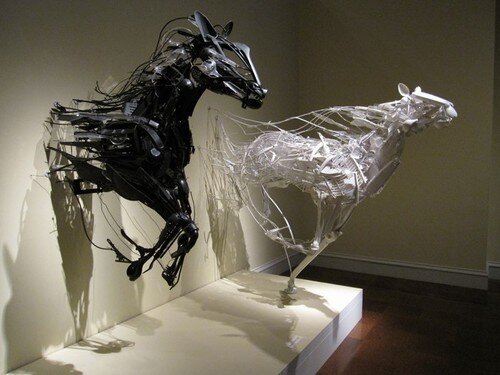
The idea of craft, in one regard, ties into the question I posed in my previous post ‘does creating art contribute to consumerism or counter ethical consumption.’ Could art and craft make use of the excess in the world us humans seem to collect and give it a new life? There are art exhibits all over the world which explore the use of recycled materials as a medium and the results can be not only visually beautiful, but also shine light on the issue of consumer ethics. Even Project Runway has asked designers to repurpose materials, whether it be cutting up their own or a fellow designer’s work, or use every scrap of fabric they have purchased. Although this has also created a friction between repurposing an old design and destroying the artistry of the garment.

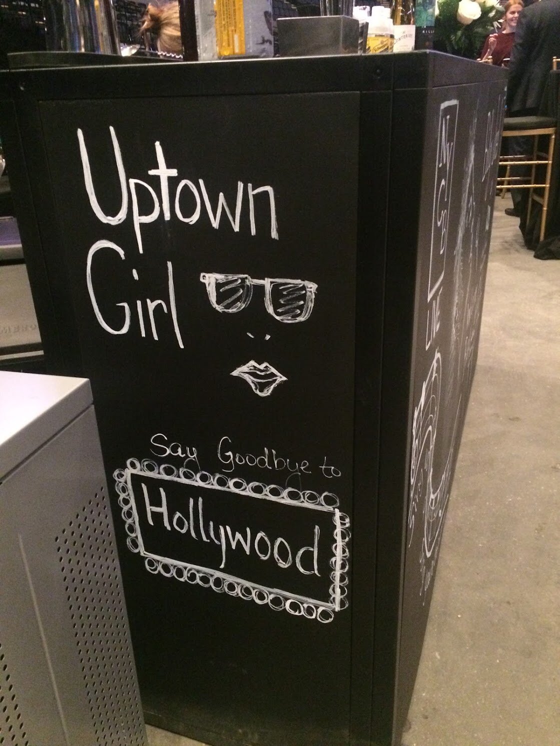
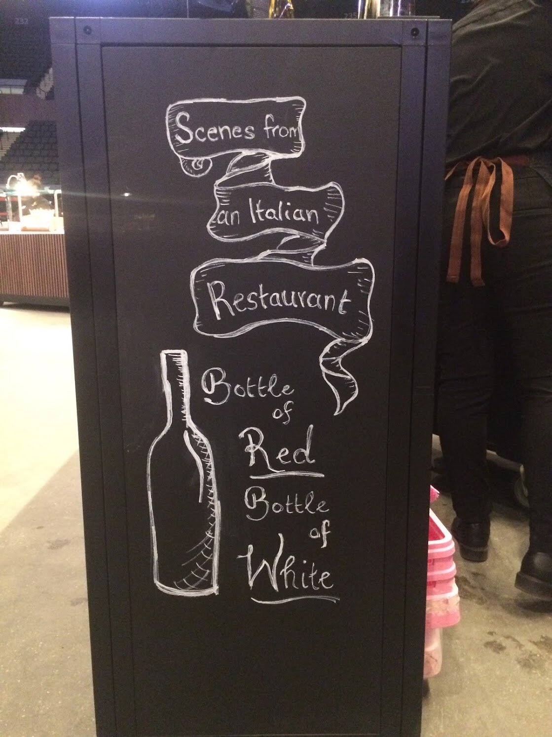
Wild’s choice to research how other artists and designers define craft is something I think is important for all designers and illustrators to do. Sometimes even our own definitions of our arts can limit our creativity. For example, it wasn’t until after a talk from Phil Cleaver that I realized how design companies often relay and depend on the creative originality of illustrators for their commissions. Illustrations and graphic designs aren’t limited to books, they’re needed for pamphlets, company websites, menus, cookbooks… There was even a time when I was working at a performance venue that my manager asked me to draw on chalkboard bars. It felt good to put my art to use in a new way using new mediums.

art © victoria trentacoste

art © victoria trentacoste

Just as Wild makes an effort to redefine “craft” for her reader, I think we too as illustrators and designers should work to expand the definition of these art forms for ourselves and others.

art © victoria trentacoste

art © victoria trentacoste

art © victoria trentacoste

art © victoria trentacoste

 
Seminar 2 - Consumption, Production, and Ecology of Design (click to comment)

Siegel, Dmitri - Designing Our Own Graves and

Littler, Jo - What's wrong with ethical consumption


To start our Consumption, Production, and Ecology of Design themed week, I read Dmitri Siegel’s essay ‘Designing Our Own Graves.’ Siegel is a contributing writer to various design blogs, creative director at Urban Outfitters interactive and videos, partner at Ante Projects, creative director at Anathema magazine, and faculty member at University of the Arts in PA, basically he is well-versed and a qualified resource on design in today’s world. Siegel discusses the DIY design style / aesthetic as a greater “design your life” concept. DIY is the new trend, and a very vibrant one at that. Every day people take photos themselves, create clothes themselves, cook food themselves, and show their skills off to the world through social media. Siegel describes how Joe Scanlan mocks this by showing a DIY coffin from an IKEA bookcase. While countless hours of thought and design goes into each and every IKEA item, from experienced craftsmen, the “regular Joe” can create a wine bar out of some old crates in a weekend. Does all this DIY take away from the artisan?

Flikr and Wikipedia create a platform where the consumer produces and provides the labor (which Siegel names prosumerism). People today have a “templated mind” which means they want to have their own input into something, play with text and layout so it fits what they imagine, and get a sense of ownership for what they commission or produce. My own website where this blog is kept is a great example of this. Squarespace allows me to play with different templates so that I can find a design that functions as I want it. But this begs the question: is my website my own work or just my images set into a template designed by a different artist?

Nowadays, publishing your writing is a snap. Anyone can simply put words up on a blog, photos up on a Instagram, or recipes up on a website, BUT what comes into question then is ownership. We, as creative illustrators and designers in the 21st century, have to be careful what we produce and where we present it. Being featured on Instagram is an honor, but being copied or having your work stolen can be crushing.

Nobody actually owns the internet. If you produce original work you technically own the copyright for it, but how do you protect yourself and your work? How do you balance sharing the art you create to gain a ‘following’ with getting that art’s value and your worth as an artist? These are the types of questions that came to my mind as I was reading Siegel’s essay. Though free access to certain things at times is helpful, even I’m guilty of seeking “public domain” art such as typeface I can download and use for free.

Something else Siegel points out is that book covers used to sell books, but now more money and effort goes into reviews and Google searches to sell a book because that’s what consumers use to gauge their purchases. Often if a book has been made into a “major motion picture” that film finds its way onto the cover of the books. Suddenly it’s as if the book needs to be validated that it’s worth reading by showcasing known actors on its cover or adding a sticker about the film, even though the words inside have remained the same. Have consumers been programmed to need validation for their purchases and interests? Have we forgotten how to trust our own instincts?

Perks of Being a Wallflower - Stephen Chbosky (cover)

Perks of Being a Wallflower - Stephen Chbosky (cover)

Perks of Being a Wallflower - Stephen Chbosky (cover after film created)

Perks of Being a Wallflower - Stephen Chbosky (cover after film created)

In addition to our thinking of what an image is, our thinking of its size has also altered. Canvas sizes have shrunk, so many things must now fit in a square to be easily shared. I agree with Siegel that new media platforms create new needs, requirements, and restrictions for art and design, but they can also generate creative thinking to find solutions. Instagram layouts that expand beyond the little squares and function as a larger image are great examples of this.

Instagram layout

Instagram layout

Instagram layout

Instagram layout

This easy access to art is a new hurdle for artists of today to face. As young illustrators and designers, I think it’s important to give your art it’s due worth and share it but not undermine its value. I have had people ask for illustrations from me and as soon as I say the word ‘contract’ they disappeared. This can be challenging. Many people, especially the DIY type, have a perception that art is so readily accessible that if one person seems too difficult there are hundreds of other artists out there willing to put their pens to work for free.

This starts to tie into Littler’s essay which speaks upon the issues of consumption and consumerism. Although Siegel and Wild were meant to be tied together, I felt Littler had a better connection to Siegel’s essays, and so for this post I will be speaking on these two. Littler discusses Fair Trade, buying local, greenwashing, CSR (Corporate Social Responsibility), and CSA (Corporate Social Accountability). Fair Trade is a concept which many people are familiar. Items in stores or at churches that are sold “fair trade” can be seen as a better option than purchasing items mass produced. But how does that effect buying local?

To really expand this thought, could the concept of “buy local” expand even to art? Don’t buy from Hallmark, seek a local artist and buy their card, or don’t go to grocery stores, buy from farmer’s markets. But then what happens to the people who work for Hallmark and at Super Markets? Where does the line get drawn between ethical consumption of products and ethical support of someone’s right to a job? Both the person handcrafting cards or growing vegetables as well as the people working at Hallmark or grocery stores need jobs (otherwise there would be no money to spend on greeting cards or broccoli, no matter where it was from), but how do we support BOTH in today’s world? If big chains did better to ensure their products weren’t mass produced by underpaid labor, would people still buy local? Littler mentions Sharon Zukin’s observation that as farmer’s markets spring up in certain areas those areas can become gentrified, causing working-class living there to become cast out. Does this not cause yet another issue?

In regards to CSR, I have worked for a bank where they made efforts to do “Good Works” such as collecting school supplies and volunteered with Habitat for Humanity which many companies utilize for work social outings. These things felt expected by the companies, but is it integral in their mission statement? Are there aspects of these companies which counters the “Good Works” CSR efforts they make?

Littler discusses how the real issue is over-buying, not what we’re buying. Humans learn to adapt very quickly, but they also become accustomed to certain lifestyle choices quickly too, such as the use of plastic or styrofoam over glass or paper to house food. Seeing the use of wooden utensils as disposable instead of plastic made me wonder why we ever used plastic (though I know it was likely for convenience in production and price). But if we could so quickly have more wooden utensils pop up, why can’t plastic be completely discarded? Then again, what effect would the increased need for wood have on our environment? Furthermore, although people have too much, what gets cut out? If everyone didn’t buy those “little extras” such as Fair Trade jewelry or handmade cheese boards, what would happen to those artists? Whatever someone believes to be the best option, art is one medium in which those feelings can be expressed.

What Littler mentions in her sections “Ethical consumption and the ‘responisibilization’ of the individual” makes me wonder who is actually responsible to change the way function as not only a society, but as mankind across the globe. Is it the job of the individual, the you and me of the everyday people, to make changes big and small such as using cloth bags instead of plastic ones or only taking public transport? Or is it the job of the “big guy,” government and corporations, to establish change? But aren’t governments and corporations made up of the everyday you and me? Are we not all the same at the core? I think that changing whose shoes you’re wearing greatly changes your outlook on issues. For example, I was in full support for the increase in minimum wage until I spoke to a small business owner. She explained that if the minimum wage increased to high, she would no longer be able to stay in business because she couldn’t afford to pay her employees. She employs students part time and for the most part they don’t need to be making a very high hourly wage. But then you look to someone who works full time at a fast food chain and needs that income to support their family, so a higher wage is necessary. How do you invoke one wage to accommodate both? You can’t. This, like most of these consumerism and green issues, in my opinion, don’t have one blanket solution. I feel that Littler’s essay seems to bring this to light as she points out multiple positives as well as flaws in the varied opinions on these topics.

Littler’s essay also made me wonder: is ethical consumption a middle-class, Americana, or UK demonstration of guilt? You likely don’t hear someone in Kenya chatting about how they bought a clay pot from a local artisan. It seems that there isn’t a single cure-all for the issues of consumerism. Littler even mentions the difficulty in singling out low-cost stores, such as Primark, as unethical in their production because it targets the working class who can only afford to shop at more “affordable” places. Littler goes even farther to say that at times the attacks on certain consumer trends is actually meant to attack specific groups of people in order to limit their power. There are such varied opinions and point of views it’s difficult to sift through them all to find one answer.

In general, it seems that both Siegel and Littler notice people want what they want, whether that be a DIY series of t-shirts or the choice to use a paper or a plastic straw. At a country club on Long Island the decision was made by management to switch to paper straws in order to demonstrate an environmental awareness, but many of the members disliked them and demanded the plastic straws be brought back. In the end, the country club had to offer both paper and plastic in an effort to please all its guests. I’ve been to restaurants where they only give you a straw if you ask, a bar where they use a piece of straw as a straw, and I’ve seen coworkers bring in metal or reusable plastic straws for their drinks in the office. Are those of us using the paper alternatives being ethical consumers while those choosing plastic are blatantly ignoring the environment? Or would someone else argue that the paper straws contribute to deforestations to produce and so none of us are being fully aware of our choices? Where does the spiral of attack cease? Do humans allow themselves to do anything “right” or are we hard wired and programmed to look for faults?

As artists, are our creations contributing to consumerism? Look at the paper we use, the paints, the countless drafts and redrafts… Does art make being ethically aware a difficult task? This is perhaps one argument I am not yet ready to tackle. But I do think that as artists we are able to contribute our opinions and thoughts to the issue. A positive reinforcement on giving of a non-material type can be seen in ‘The Gift of Nothing’ by Patrick McDonnell, the illustrator and genius behind the Mutts cartoon. Personally, I think it says quite a lot.

Patrick McDonnell - Mutts

Patrick McDonnell - Mutts

 
Victoria TrentacosteComment
Seminar 1 - Race, Ethnicity, and Nationalism (click to comment)

LefÈvre, Pascal - The Congo Drawn in Belgium 


The article ‘The Congo Drawn in Belgium; by Pascal LefÈvre personally left me with more questions than information. LefÈvre starts by giving a very quick and somewhat sporadic history of the relationship between Belgium and the Congo and then states that he will be exploring how comics in Belgium, starting in the 1880’s to the present (or at least 2008 when the article was written), incapsulate the complex and varied view of the Congo in Belgium. Some of what LefÈvre focuses on is the evolution of the comics in representation of Africans, depiction of the characters, and background settings. Perhaps the lack of visual aids in the article contributed to my difficulty in finding it captivating. It is incredibly difficult to read someone describing a comic without having said comic in front of you as a reference. I was able to look up some visuals on my own, but I would have preferred the exact image being discussed at hand to better understand the article.

Two of the comics LefÈvre mentions are Tintin au Congo by Hergé and Blondin et Cirage by Jijé. The Tintin comic was the most successful Tintin story of the 1930’s and featured ill-educated Africans juxtaposed against impassioned, devout missionaries. The original version of Tintin showed Tintin teaching the Africans geography to show where their home, Belgium, was located (which demonstrates that the Belgium felt they had the right to dictate how the Congolese should identify, ie. as Belgium) while a revised version showed Tintin teaching maths. His sidekick, a character named Coco, represented the Congolese as skittish with simplified French language skills. Meanwhile in Jijé’s comics the Cirage character portrayed the Congolese as active, courageous, capable of speaking French well, and synonymous with a “brother.” At times it portrays Congolese as strength against common enemy, such as Americans.

Tintin au Congo by Hergé

Tintin au Congo by Hergé

Blondin et Cirage by Jijé

Blondin et Cirage by Jijé

The Belgium comics changed over time based on the political and social environment of the times. From the 1880’s-1930’s there was a significant amount of colonization propaganda, though the later years showed work being more “friendly” towards the colonies. Art during time of WWI showed African people as uncivilized and yet brave while also praising the benevolent white man and his good deeds done to the African man. The 1930’s - mid 1970’s show white heroes against an African backdrop, but doesn’t directly mention the colonies (see LefÈvre pg 168). This was because Francophone Belgian publishers wanted to protect the French language and so Belgiums had to censor their comics when written in French. Afterward the comics became more popular for French. Next comics morphed again as more Africans held higher positions, the representation of Catholicism quieted, and decolonization became prevalent. The 1970’s showed increased violence and a more realistic style.

LefÈvre details several comics and describes how the way characters are drawn greatly effects the perception of them. A good example of this is caricatures, which LefÈvre does mention as being used in the Belgium comics. Caricatures are a great demonstration of how art can exaggerate certain perceptions such as the features on a person’s face (a classic is the Jay Leno chin). In a similar fashion, cartoons can enhance an issue making it easier to understand. This is how cartoons can become particularly influential on the young who may see an image, such as an African hurting an American and being celebrated for it in a Belgium cartoon, and then learn to associate ideas that coincide with those images. In this way cartoons are highly effective tools for teaching values and customs of a culture.

Tom Richmond

Tom Richmond

Prior to reading this article I was actually somewhat familiar with the issues in the Congo because of a necklace I saw a friend wearing about 6 or 7 years ago. It was a silver whistle on a long chain and was rather eye catching so she was questioned about it quite a bit. The company where she got it was called Falling Whistles (unfortunately I am not sure if they are still active) and the company sold whistles in order to spread the message of hope for peace in the Congo. The idea came from the fact that boys who were too young to manage a gun in the war were given whistles as their only weapon. The necklaces were an effective tool as there was both artistry and significance to the choice of a whistle. Similar to how a cartoon can convey a deep message through visual means, so too can a piece of jewelry. Art, in any form, has a way of grabbing a person’s emotions and, consequently, connecting them to a cause.

Personally, I feel that LefÈvre neglects to explain why the Congo was such a popular topic in Belgium comics for such an extensive period of time. Did it start from a sense of pride for colonization? Was it because the Congo seemed exotic and so it became a sense of escape for the Belgium audience? Or was it to illustrate the sharing of Belgium values and western education? LefÈvre seems too caught up in outlining the history of Belgium’s relationship with the Congo (which is rather extensive and likely needs even more of a background in order to effectively understand the presence of the Congo in the comics) instead of what drove the Congo as a subject matter and what effect those comics had. How did the people of Belgium interact with the comics? What was the opinion of people of the Congo, or were they unaware of the comics? How did it effect the youth? Did it influence their opinion of the relationship between Belgium and the Congo? Often a younger generation seeks to change or be different from the generation above, was this the case? LefÈvre only touches on how decolonization became a sensitive subject across Belgium and other countries, but there must have been varied opinions. How were the comics circulated? Who were the readers?

On the whole, what LefÈvre touches upon is relevant not just to the Belgiums, but to many countries across the globe. At the moment in the US there is a lot of friction concerning immigrants and opinions as to the issue vary across states, or even areas of a state, as well as across generations. There’s a political cartoon by Steve Kelley which I came across years ago and it has always stuck with me.

Steve Kelley

Steve Kelley

Kelley seems to put into perspective what we define as belonging to us or someone else, which has a lot to do with immigration as well as colonization. At what point does one person takeover ownership of a place? When does someone belong? In the Tintin comic, the Congolese are being told they are Belgiums, but is that how they identify? Who gets to decide? LefÈvre details much of why there is a complex relationship between the Belgiums and the Congolese, but I think he misses the human side of it, how the comics influenced opinions and how opinions influenced the comics, not just what the comics contained.

Political cartoons and comics are great vehicles for presenting and documenting opinions. Every day there cartoons published in newspapers which capture current events happening in an area or across the globe. They become excellent resources for history, time capsules for future generations. Looking at cartoons gives great insight into what issues have been important to a culture and how people viewed those issues. My history books were filled with them and even today I find that I can learn a little something about what’s going on in the world simply by thumbing through some political cartoons being published. While LefÈvre, I believe, set out to prove that cartoons representing the Congo in Belgium changed as feelings towards the relationship altered, there seems to be too much history to comb through before his point can be effectively made.

Khalil Bendib

Khalil Bendib


Reference:

LefÈvre, P. (2008). ‘The Congo Drawn in Belgium.’ History and Politics in French-Language Comics and Graphic Novels. 166-185.

Links:

https://www.fallingwhistles.com/


Victoria TrentacosteComment
Seminar 1 - Race, Ethnicity, and Nationalism (click to comment)

Garfield, Simon - Can a Font be German or Jewish?


Reading Simon Garfield’s article ‘Can a Font be German, or Jewish?’ brought light to something I subconsciously knew: fonts have a significant impact on the way we interpret the meaning of words and the greater image they accompany. In his article, Garfield describes the breadth of fonts in today’s world, as the vast selection in FontBook demonstrates, and how certain fonts have a very long and somewhat unfavourable history. Garfield focuses on Erik Spiekermann who is not just a co-founder of FontBook but an aficionado in the world of typography. The fonts encapsulated in FontBook mimic handwriting, typewriters, Middle Eastern markets, and range from the classic roman and gothic styles to the ridiculous such as Old Dreadful No 7 which resembles icons more than letters.

Futura font

Futura font

Old Dreadful No 7 font

Old Dreadful No 7 font

The article describes Spiekermann as a well versed designer as well as an incredibly thoughtful one. He creates fonts with a concept in mind, looking to feelings and emotions. Despite this, the client doesn’t always follow his planned vision. The Berlin Philharmonic, for example, took the font he created for their logo and ignored his recommendation of presenting it on a landscaped backdrop (see Garfield pg. 184). Spiekermann describes his annoyance with clients at times and I believe this is a feeling with which many commissioned artists could identity. As an illustrator, I may have a specific layout or font in mind which I feel best pairs with my images, but a publisher may have a different vision. The art world, whether it be image or text, is satiated with the need to navigate through these technicalities, balancing the feelings of the artist with opinions of the client, before a final piece may be produced.

Berlin Philharmonic - logo

Berlin Philharmonic - logo

This is magnified in the works of Paul Renner who invented the font Futura in 1924. Renner was working in typography during the Second World War and found militaristic disapproval of his Futura font by the Third Reich when he first developed it. His roman styled text was in direct contrast with the gothic style exclusively used by the Nazi regime. The Nazi developed “jackboot gothic” font as one synonymous with German values and superiority. Renner and others using roman styles were seen as against Germany and therefore enemies. But when the gothic style became outlawed, whether it was because of its Jewish printing association (as the Third Reich would have people believe) or because of the difficulty producing and reading it, the roman style quickly became accepted. This is where the title of Garfield’s article comes into play. Regardless of the true reason behind the switch from gothic to roman type, each text visually conveys different emotions and associations.

I came across a blog by Craig Ward and he states that good typography should be invisible, a point with which I believe Spiekermann would agree. This means that the text should fit seamlessly with the overall image and message of a finished piece. Fonts can make people feel different emotions which is why the right font is so crucial. In the article ‘The science behind fonts (and how they make you feel),’ Mikael Cho describes how humans associate certain styles with specific messages. Cho demonstrates this by showing a Bank of America site as it is and as it would look with a font associated with newspaper headlines.

Cho, M. (2017). ‘The science behind fonts (and how they make you feel)’

Cho, M. (2017). ‘The science behind fonts (and how they make you feel)’

Cho, M. (2017). ‘The science behind fonts (and how they make you feel)’

Cho, M. (2017). ‘The science behind fonts (and how they make you feel)’

The whole feeling of the page completely changes, the second image no longer feels like a banking website, it almost looks like a fraud. This shows that even before you read what is written, the visual that the font and layout convey has already dictated your understanding of the text. It can be painfully obvious when a font is wrong, more so than when it’s right. If Lisa Frank folders were written in a graffiti style it would seem that they were perhaps no longer intended for school children, despite graffiti often containing bright colors.

In regards to how to select the right font, Cho explains that the Il1 (capital ‘i’ with a lower case ‘L’ and a number ‘1’) test is a good indicator of how a font will work. Personally, I plan on using this technique, especially since at the moment the word “Illustration” is appearing quite frequently in my day-to-day life and the ‘ill’ beginning can be tricky to read.

Having preconceived associations with fonts is something I believe all people do whether they are aware of it or not, and I believe those associations are heavily influenced by personal experiences. For example, Paul Renner, who lived in a different time and place than I have, would likely associate gothic font more with the Nazis than anything else, however I associate the style more with history and age. A good example of this can be seen in newspapers. For me, The New York Times font conveys a sense of longstanding history associated with dependability and accuracy. TIME magazine is modern and clean, it makes the information seem current and to be taken seriously. The New York Post is bold and conveys a sense of urgency and pop news.

The New York Times - August 6, 2013

The New York Times - August 6, 2013

TIME - October 28, 2013

TIME - October 28, 2013

New York Post - June 27, 2018

New York Post - June 27, 2018

Another aspect of Garfield’s article which I found speaking to me personally was Spiekermann describing his struggle of working in a digital world since he grew up using wood/metal typeface. He describes that it is a challenge to “create warmth in a digital world” (Garfield, pg. 187). I, too, prefer to work in a physical medium over a digital one. Part of this is due to the fact that I am rather green regarding the digital language of art, but also because I find there is something in my own art that is lost in the digital platform. I enjoy the imperfections of my lines, the stray pencil mark or the feathering of an inked line. For me, my art in digital form comes out too “clean” and lacks something of the art I produced in creating it. The digital image becomes informal and sterile in its perfection. While I have the highest regard for those who not only work in the digital imagery world, but triumph in it, I prefer the physical with the soft, “fuzziness” (Garfield, pg. 186) Spiekermann found in his metal and wood block fonts.

At the moment our MA has an assignment to create an editorial cartoon and so I have been looking at various types of comics. I have noticed that cartoons have a certain expected feel and sense about them in regards to the font. Capital letters are often used for their legibility, but the little finesses of the lettering can completely change who might be the intended audience. Cartoons for kids I find to be clean, neat, and simple while ones for adults can be sharper and sometimes have a snarkiness to them, being a bit too thin or close together. The font styles and images come together to create a tone for the piece as a whole.

Peanuts - Charles Schulz (audience = kids)

Peanuts - Charles Schulz (audience = kids)

Bill Day (audience = adults)

Bill Day (audience = adults)

Marmaduke - Bradley Jay "Brad" Anderson (audience = kids)

Marmaduke - Bradley Jay "Brad" Anderson (audience = kids)

Mike Keefe (audience = adults)

Mike Keefe (audience = adults)

We are inundated with different fonts every day and it’s amazing how despite the variety out there, certain fonts are so easily recognized. A single letter can change how you feel in an instant. The letter “M” in a McDonald’s logo is dramatically different than in a Macy’s logo. And the letter “N” changes when it’s typed like Nordstrom vs. Nike vs. New Balance. What’s more, even though both Nike and New Balance sell athletic clothes, you acknowledge that they are not the same brand. Personally, I associate Nike with basketball and New Balance with track, perhaps because of the “swoosh” in Nike vs. the movement in the New Balance ‘N.’

McDonald’s - logo

McDonald’s - logo

Macy’s - logo

Macy’s - logo

Nordstrom - logo

Nordstrom - logo

Nike - logo

Nike - logo

New Balance - logo

New Balance - logo

If a company gains a negative association, its font, logo, and name can quickly become mud. McDonald’s has become associated with cheap quality after “Super Size Me” came out and Nike’s brand took a beating after the Colin Kaepernick ad. Political cartoons mocking these companies need only place a golden arch or “swoosh” into their drawings for the audience to know instantly the reference. The little icons fit in so seamlessly with the fonts that the eye almost inserts in the full brand name when only the icon appears. These company logos and fonts hold a strong representation of the company, despite the associations from bad press.

Thomas Bolt

Thomas Bolt

Chip Bok

Chip Bok

Garfield’s article brings to light a number of interesting points regarding fonts and typography such as the influence of technology, not as it regards the digital way to produce font, but rather its way of making fonts universal. Modern technology has flattened the world. Cities and countries once were able to inject a certain thumbprint and identity into the fonts they used, but today fonts are shared across the globe, eliminating that sense of individuality and uniqueness (see Garfield pg. 193). Despite this, I believe that people will continue to have personal associations with fonts based on when and where they first came in contact with said font. Helvetica was the font of choice in my previous job and even though I was familiar with it prior, it shall forever remind me of my time working at that theater.

On the whole, much of what Garfield touched upon in his article was incredibly applicable to me as an artist. Font is important in my own art, I scrutinize over which to use for my blog, business cards, logo, and books I write. The font I choose creates a personal identity, and I want to ensure that the emotion it conveys matches my own voice. Font association starts at a young age. Even today if I see an ‘i’ dotted with a big, bubbly circle I am brought back to when I first learned to write and had to decide if I would be a circle or a dot person when writing an ‘i.’ These are memories we carry with us, all packed into the way a word looks on a page.


References:

Garfield, S. (2011) ‘Can a Font by German, or Jewish?’ Just My Type. 181-196.

Links:

The Science Behind Fonts (and how they make you feel)

https://thenextweb.com/dd/2017/03/31/science-behind-fonts-make-feel/

Craig Ward

http://untcomdes.blogspot.com/2010/04/good-typography-is-invisible-bad.html

http://wordsarepictures.co.uk/

Graffiti

http://www.mrpilgrim.co.uk/funky-graffiti-lettering/#.XapR6OdKhE4


free writing

topic: why did I choose to study a MA in Children’s Book Illustration and Graphic Novels


Sometimes you have a hobby and that is all it ever is for you, something you do on the side in your free time, something you just enjoy. But once in a while you start to wonder if that hobby couldn’t, just maybe, be something more. Last year I found myself at a crossroad. It was early October and I had just finished running a successful Gala at the theater where I worked (250+ guests at dinner with over 2,000 attending a show featuring Diana Ross). The guests were happy, the honorees left satisfied, and in my heart I knew the event had run well. But deep inside my subconscious a thought which had long been festering began to rise to the surface. Somewhere in my gut I knew. A successful event, a job well done, patrons and my boss satisfied, all this did not make me feel truly fulfilled. I was proud, absolutely, and what I was doing did hold significance to me. My work was important. Yet when I went home and found solace in my sketchbook, in creating little cards that made me smile, it became clearer. It was here, in these small and simple drawings, in moments of imagination, that I felt content and fulfilled. An idea both terrifying and exciting came to me: I could either strike off on a path towards something which had long been a passions of mine (children’s book illustration) or spend the rest of my life wondering what would have happened if I had. It was here that I decided to take a chance, to try to make my hobby something more, to let this little thing that has given me so many small moments of joy give me something more - a true sense of completeness. And perhaps a chance to share that joy with others.